




◆ ARTICLE
Mobile-first store: 8 principles for a shop that is easy to buy from on a phone
◆ DETAILS
Most visits to online stores now happen on smartphones. We show how to design a shopping experience you can complete with your thumb - from search to payment.
In most online stores more than half of all visits now come from phones. Even so, many stores are still designed for the desktop, with the mobile version treated as an add-on. Mobile first reverses that order: we design comfortable shopping on a small screen first, and only then expand the layout for larger ones. Here are eight rules we follow when designing online stores.
1. Speed above all
On a phone, often with a weaker signal, every second of loading counts. Light images, fewer scripts and good caching are the basics. Read more in Core Web Vitals in practice.
2. Simple navigation and search
The menu should lead to the main categories in two or three taps. The search field must be visible straight away, because on mobile many people start shopping with it.
3. Convenient filters
Filtering by size, price or brand should open in a comfortable panel, with large checkboxes and a clear "Show results" button.
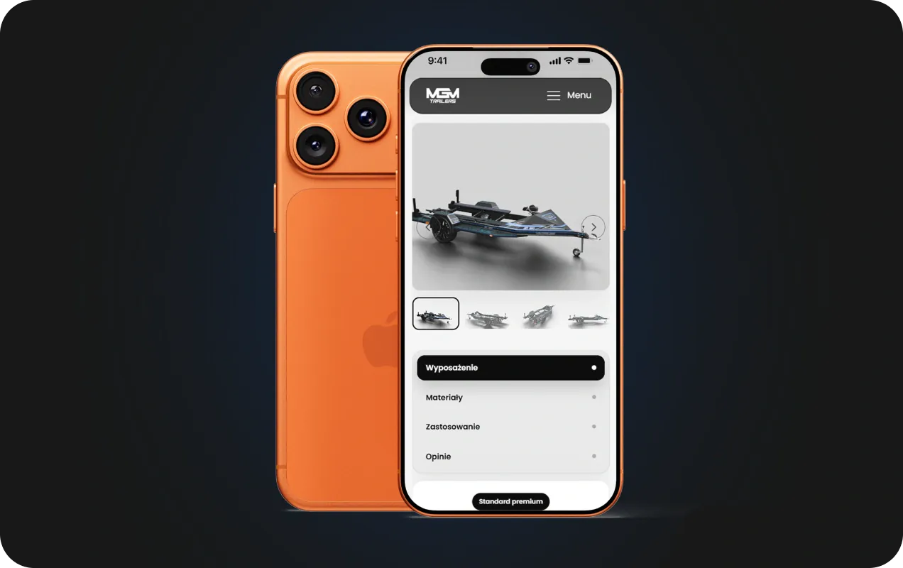
4. Large swipeable photos
On the product page photos should fill the full width of the screen and respond to swipe gestures. Zooming must feel intuitive.
5. The buy button always within reach
A sticky bar with the price and the "Add to cart" button means the customer does not have to scroll back to the top. Buttons should be within thumb reach and large enough.
6. A short, simple checkout
The order form is the most tiring part on a phone. Limit the number of fields, use the right keyboards (numeric for phone numbers and postcodes), allow guest checkout and remember the details.
7. Fast payments
BLIK, Apple Pay and Google Pay let customers pay in seconds without typing in card details. It is one of the simplest changes that make mobile shopping easier.
8. Readable content
Text must be readable without zooming, and the key information - price, availability, shipping cost - visible straight away. Long descriptions can be folded into expandable sections.
How can you tell whether your store is mobile first?
- make a purchase on your own phone, from searching for a product to payment
- note how long it takes and where you have to stop
- check in your analytics at which step mobile customers most often drop off
- test the page in PageSpeed Insights in the mobile view
Mobile first in practice
We design every store for the phone first: from the home page, through categories and product pages, to the cart and payment. You will find examples in the KST Gear and DTFX case studies. If your store is already running but mobile sales are weak, refining the key screens and the checkout is often enough.
See also which elements a product page that sells should have.
Frequently asked questions
Do I need a separate mobile app?
Usually not. A well-designed online store works comfortably on a phone without installing an app.
Can an existing store be improved?
Yes. We often start with the product page, the cart and payment, because changes there have the fastest effect.
How much does it cost to adapt a store for mobile?
It depends on the platform and the scope of changes. We will agree the scope and cost in a project quote.
◆ MORE GOOD THINGS
SEE OUR BLOG




 We respect your privacy